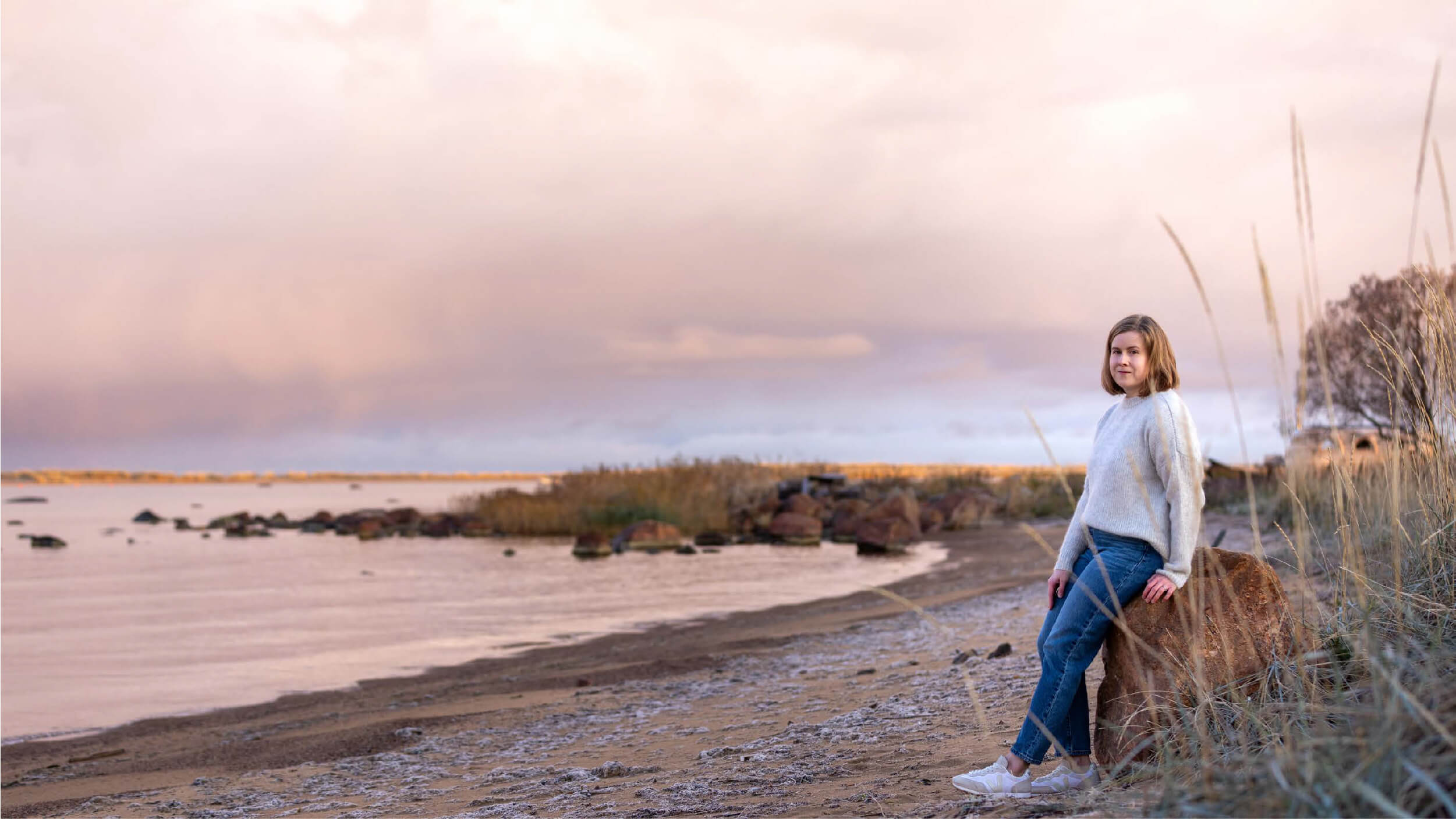
What we had in mind was a fresh and brave image, a color scheme that matches the lifestyle of the area and a feeling that makes you long for the elements of the arctic coast.
Kalajoki local professional Saara Santala took on the challenge and dived deep into the core of coastal arcticity in the creative process. Saara started where most Finns would start, in nature.
“This design project has been very close to my heart and important for me. The unique maritime nature with its rugged islands, rocks, and tall pine tree forests is part of my everyday life. At the beginning of this project, I collected colors from nature, I was inspired by the different shapes of the sea ice, the whirls of the waves and the changes of light – all these elements that are present in the local nature” Saara describes and continues “I wanted to showcase the unique arctic rugged beauty of the area so that subdued elegance is paired with strongly recognizable elements. For me, arctic maritime nature represents purity and peaceful presence. I feel small in a good way with the sea breeze and when the surf hits the rocky shore. I think that the straightforward culture, community and living with the rhythm of nature connects us all who live here and calls to the ones visiting us – the essence of life becomes clear.”
In the colors of Visit Arctic Coast, one finds shades called Deep blue sea, Bright heaven and Sand. We also have Sunset, Fog and Moss. The dashes of red of course come from the red archipelago cottages.
Saara created a clear, contemporary logo that is easy to use in any context and can be paired with a destination name, slogan, or coordinates.

So, what does the Visit Arctic Coast marketing team think of the image and brand?
“Saara has captured the colors of the coast perfectly. This color palette will underline our message and frame the pictures magnificently” says Jaana Sirkiä, Sales Manager at Visit Arctic Coast.
“The logo is inspired by the rifts in the sea ice and is at the same time strong and sleek. It speaks to the right target group and can be used in all kinds of marketing materials that we will have in the future” thinks Anu Kärnä, Sales Manager at Visit Arctic Coast.
“Overall the branding was just perfect. We are very happy with everything and Saara really captured the area and our thoughts in her work. The last addition to our brand book was the lighthouse sign. Sometimes you need a sign, a strong element to feature your message, create interest and say more than words can. Something that you are recognized by and that is more than a logo. We asked Saara to create a ‘cherry to top the cake’ and are very happy with the lighthouse symbol. Visit Arctic Coast is about discovering your north and when navigating through coastal and archipelago landscapes you always look for the lighthouses and use coordinates,” says Janne Anttila, CEO of Visit Arctic Coast.


